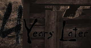
4 Years Later
Liam Aspinall (415796)
unit 6: visual production
evaluation
- Introduction
This unit is to explore the visual side of
media a planning and preparation of get equipment to get the shot we want.
The other side of this unit is to make
generic a DVD and poster and for this I chose the film diary of the dead by George
A. Romero because it is a classic film and it comes out of the minds of one of
the greatest directors of the horror genre and because it sort of relates to
this course as it’s about media students.
2 Starting points
The genre I am aiming for in my final
project is apocalypse style of film, this photo show it by having one person it
the shot being surrounded by decaying and destroyed structure emphasise the
apocalypse genre so that why I pick the location of Erne farm for one of the
reasons because of the fact it is abandoned and left to decay by weather which
makes it suit the ideal place to film. The weather plays another factor in this
because of how grim and bleak it look.
What gave me the idea of doing this for a
trailer is my hobbies of Urbex (Urban Exploring) and my friends who just said
to me to make it about something I love doing so that’s why I chose to do
apocalypse style of trailer with help from them being the actors in it, which
in return helps them in there get free promoting but I did have to pay them to
help (I pay them in food)
3 Why
A lot of the shots I use was mainly
stereotypical of a horror genre like the tracking shots so it focuses on the
main protagonists more to conceal the identity of the antagonist for as long as
possible until I thought he should be revealed to add suspense on why and who
is chasing him.
I sort of never add the reason why he was
being chased so the trailer sorts of makes no sense to anyone who wasn’t there
helping... but the reason why he was being chased was because was immune to the
virus and then saying that I never said how the apocalypse stared but if we get
to make a short film I will be able to go in depths more.
I used other shots like the mid to wide and
high angle shots to help show of the location of where we film it and to get
more of the Action shots in one frame
4 What – description
We were asked to make a trailer with the
minim of 45seconds but I was under that by 9 seconds with 36 seconds this is an
improvement on my first attempt of it was 30 seconds. I normally edit along to
the beat of music and the song I used was the ending of the song I used in my
short film Stalker. The song is call cannibal by ross bugden I found on
soundcloud. I found the song had a nice up beat to it that went well with the
visual effects.
5 Production
I decided to go with actors I know we took
up a lot of the roles our self. I was mainly the director and camera man but
Jared (the protagonist) help set up some off the shots because of the how the
fight scene was choreographed in a small space and we didn’t want them to come
too close to the camera. We did get help on the second day of filming by my
friend tabby and girlfriend they both help in the scene where the respirator is
thrown out of shot by Ethan, tabby had to catch it so it won’t break when it
hit the floor and they was both sat on the sofa on the cut scenes back at my
house
6 Creation
I decide to use Sony Vegas pro 2013 on my
home pc to edit most of the trailer instead off the macs at colleges that use
adobe premiere pro, because there was more effects I had available on my pc
than there was on the macs like the TV glitching effect which I thought went
really well part from the fact I had no controls on when it glitch in on the
clip because I haven’t learnt how get them to work at the time I want them to.
I did use Premiere Pro and Photoshop to make the title that appears both in the
poster and the ending of the trailer. I did use a text maker for the letting
online to make the text I use.

7 Conclusion
Well what I think about this is project is
that I could of done better there was a few things I could of done better but
we didn’t try because of how long it would f took to get the resources there
and set them up it would have been to late and dark it would of involve trying
to get a 4wd truck in throw a small gate without draw attention and saying that
the lights on the truck would probably be to bright and make the shot look
shit.
I had another problem with lighting was in
the living room you could see my shadow and the camera on the wall as I move
closer towards the TV.
There was a few things I like was the some
of the high angles and the tracking shots. The other thing I like was the black
and white shot which I add more tone and vibrant to the shots by playing around
with colour corrections to try and set the mood better.
The finally reason why I like it was the fact
I got work with my friends on this project and got to travel and have the
capable and the equipment to do this.


No comments:
Post a Comment