Horror-
Stereotypical horror film is that it a lot of blood and gore and the odd jump scare that enhanced by music to add more dramatic in to the film.
a lot of the horror films use dark and dingy locations and often a lot of the scenes use the weather to its advantages for example the rain and fog can set suspense to scene in the movie
Comedy-
A stereotypical comedy movie is often very bright and colorful. And often the leading acting roles are by famous comedians actors like Jim Carrey, Will Ferrell, Adam Sandler, the list goes on.
But comedy can go between to types:
- Ones of children to understand that are often reference to as family comedies for example "Mr Popper's Penguins, Big Mommas House and Home Alone" which are made for children to understand.
- Then you got adult comedy that often use a sense of humor that the older generation would understand the references more. For example the film "TED, Scary Movie and jack ass" all contain some sexual or drug references that younger people wouldn't understand yet.
Tuesday, 26 January 2016
Tuesday, 12 January 2016
Poster And DVD Cover
My original movie poster made in to a DVD case.
i use some of my poster image like the camera and i also use some of the original DvD text and description to save time on typing it out. i mess up with age rating because it is actually 18 but i put is a 12 for some reason.
Tuesday, 1 December 2015
Monday, 23 November 2015
College Short Film Review (Stalker)
We where the set a task of making a horror genre short film.
So we're set up into a production team at random by our tutor.
Our director was Nikita.
The cameraman was Ed.
I was the video editor.
And the fixer was Jack
I know I have to write my own review on my own my own editing skills and Ed's filming skills.
factors Is actually pretty much hate this video because because of the tripod, audio and how slow Jack was walking and the fact that he mest up couple of times like like between 1:27 and 1:28 if two separate shots yet I had to sync them up as the best I could.
Because in the first shot he didn't look out the window like he was supposed to.
In the second shot we started filming and he walked around the corner bit weirdly so I had to cut it and mach the two pieces as smoothly as possible
in the first scene we had a failure with the tripod where we forgot to loosen the scrwo that allows us to Pan upwards so it jolted up in stead of a smooth tilt
with in the first 3 scenes had to be sped up because Jack's walking speed so we had some strange movements by people in the background off the shots like the speed of some of them walking with superhuman speed.
things I think work well was the color change between the scenes with Jack and the girl who's stalking because it emphasizes who his target was going to be in this case my friend Amelia from level 2 art who i ask to help in her 20 min lunch break.
Another thing I think work as well was the music emphasized the Loneliness he had until he found his victim And the spike in audio add drama to the video so does the raising heartbeat and scream at the end of the videos was be added as a jump scare
Suicide Squad Trailer 2016 (college Edit)
We was given the task of making the teaser trailer out of some brand new film release trailers so I chose the new Suicide Squad trailer.
What I thought worked well was the music and the clip I chose for the video because it adds more action feel to the video instead of a calming relaxing like the Originals song did.
Choosing the song for it I had help with by Jay.
I mainly chose the action clips because the background song emphasizes that this film is an action genre.
What I could have done better was to mix the clips better
and do a little bit better on fading and time besides that I think I did a really good job of it
Thursday, 19 November 2015
original movie poster design (diary of the dead)
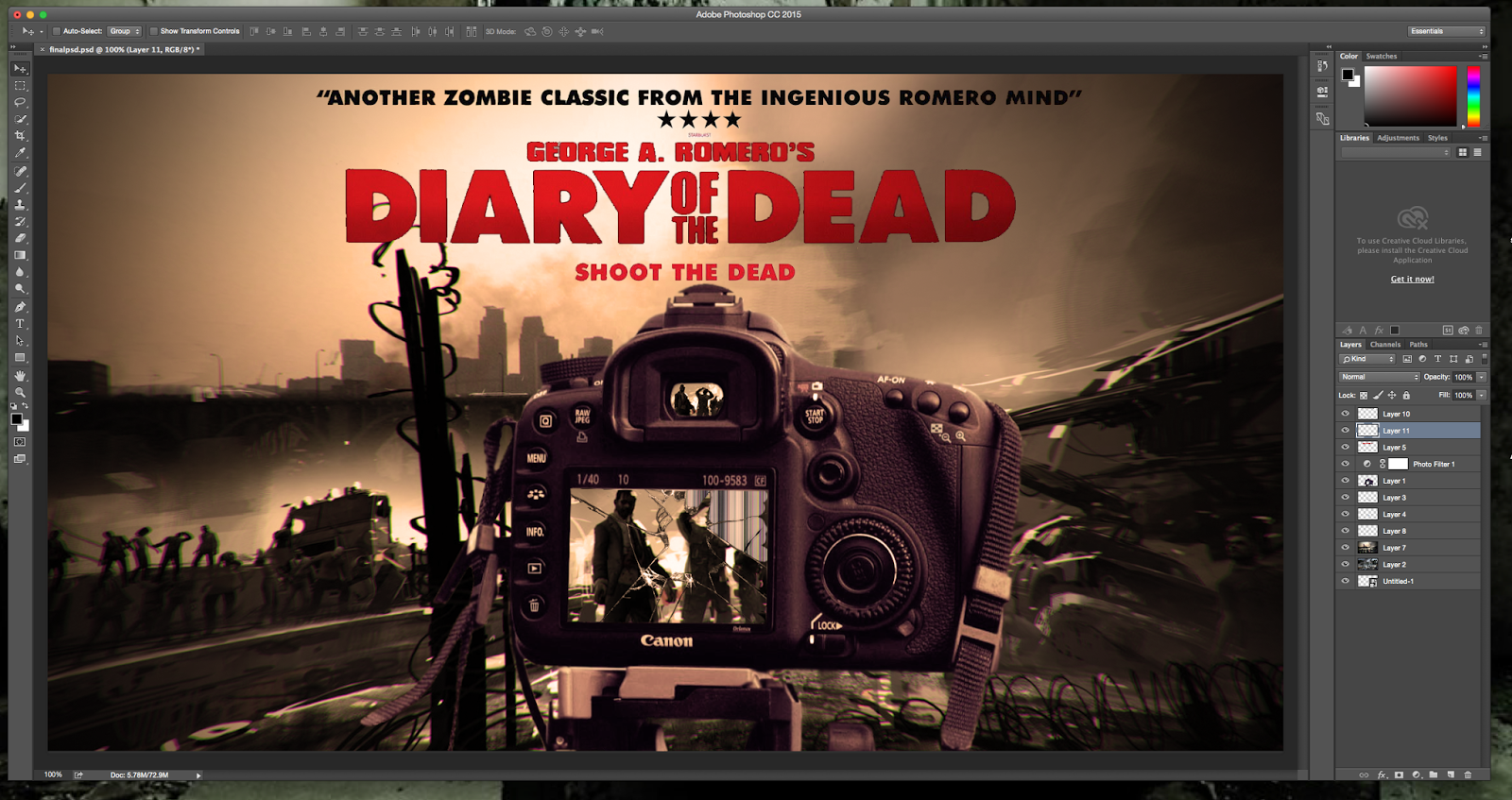
This is my final piece
I decided to pick diary of the dead is my movie poster because I like the horror genre and the director George A. Romero set the standards of most modern day zombie based films and TV shows .

This is what I was going to originally uses my poster but I found the image to be to a bit to computer animated of the original movie poster design it made the camera in the foreground stand out a lot.
Original background was from a game called Left 4 Dead, I've never played the game but originally chosen this photo because of their background scenery and on the fact that there was a zombie dead center in the photo so it make it easier when editing one into it
In the original movie poster use a flip screen camera but went along the lines of using a DLSR camera because it was hard to find a flip screen camera at the right angle for the photo I wanted to use
I came across this photo by typing name DSLR wallpapers for computers
Like in the original movie poster the camera has a smashed screen so I decide to use this photo which is another wallpaper but this time for mobile phone.
this is something I have added on my own according to make the photo more unique, you normally see this on a smashed TV screen. I thought it would look cool on a DSLR camera screen as well.
This is the new background photo decide to use. I'd found it on my Tumblr news feed on the post-apocalyptic website.
The text and the five star rating I stole from one of the original movie posters because it was easier than me typing it up and finding information out online
I crop the camera and removed the photos from the background And the LED screen. Which took me about 45 minutes to do.
The crack in the LED screen took a lot longer because of how highly detailed it was.
I had to go in to find the details because I wanted to make it transparent but yet have to crack still visible.
I use the multi coloured cracked screen to emphasize that the screen is actually broken.
Then I added the background I wanted to use and fitted it perfectly and lined it up.
Then I duplicate the background layer crop it down to make a smaller photograph of the LED screen on the camera then moved it so it went into the eye of the camera.
T
hen I warp the original background image and add a filter layer between the writing and the background and camera.
Then I started to blend the camera so it would fit nicely and wouldn't stand out as much on the background layer.This is the similar movie poster that I was trying to recreate.
Subscribe to:
Posts (Atom)